Thursday 27 November 2014

Lecture 8 - Globalization, Sustainability and the Media


  • Globalisation is the way in which organisations or businesses build up an international influence. Examples of companies like this are McDonald's, Starbucks and many more, with them defining what the principles of fast food restaurants and coffee shops are.


  • These aren't necessarily good jobs to have, due to the low chance of promotion and low profits, but they are promoted as the easiest and best places to buy foods and drinks easily.


  • The TV, newspapers and the internet are all ways of gaining international influence over certain views, with the Western culture being the main dominant with certain channels and newspapers. Saying this, it is actually the owners of the channels and newspapers that determine the content of their works - newspapers in particular can only talk about the news that they want to - so they can back certain political parties during a campaign, and only advertise the sides of the stories which will earn them more money.


  • The news in general tend to divide the world into territories, depending on their market importance - for example the USA is the most important, and the least important are areas of the Third World such as parts of Africa.


  • In recent years, the internet has become huge within society across the world; it makes it easier to communicate with people, theoretically bringing us closer together - however despite the theory from the 1960's that it would connect us, the "global village" as it described, isn't necessarily how the internet has been used, but rather as another tool to influence people into the views of the government.


An example of globalisation within animation is in the children's TV series 'Spongebob Squarepants'. Set in a city called Bikini Bottom, numerous occasions have shown the whole city being influenced by the irresistible burger, the krabby patty - the main bad persona, Plankton's, whole character is based on him wanting the recipe for the tasty burger so he can rival with the only restaurant that sells them and his main enemy at the Krusty Krab.


This represents how our culture is heavily influenced by fast food companies, although not to the extremes demonstrated in the TV show. It becomes so extreme that in the most recent Spongebob film, 'Sponge out of water' to be released in March, the plot is driven by the main characters recovering the krabby patty recipe due to an apocalypse that broke out after it went missing.

I'm sure the real world wouldn't break into an apocalypse due to the lack of fast food, but this example shows how effective advertising and having an influence in the world can be.

Thursday 13 November 2014

Lecture 6 - Consumerism - Persuasion, Brand, Society, Culture


  • Consumerism is defined as the protection or promotion of the interests of consumers (aka the general public), meaning higher powers such as the government want to influence people to believe in the same ideals as to what is best for them.


  • Sellers of products use various advertising techniques to convince the public that luxury products are actually a necessity. They use celebrity endorsements and unique ways of advertising to differentiate themselves from their competitors, despite it being pretty much the same product, to convince consumers that they are the best.


  • An example of something that has been advertised differently over the years is smoking. It has changed based on the views of society throughout time - so at first it was considered "uncultured" for women to do it compared with men, then Bernay's advertised them as "torches of freedom" which appealed to women because they associated smoking differently - as if you smoked you were sexually desirable and independent. This is a good example of how people thought they were making a free choice, but were actually influenced by the media's opinion.


  • Another way advertising has influenced us is through food - with cake-making mixtures (e.g. Jemima's Pancakes) people believe they are being creative, when they are actually only completing simple tasks.


A good, yet extreme example of how consumerism is represented in animation is 'The Lego Movie'. Their government have brainwashed common workers and consumers of their products and have influenced them to all work in sync. This is shown through a song that they have introduced to the consumers; 'Everything is Awesome', and instructions into the right way to live, which have brainwashed the public into thinking the political views are their ideals.

In this video some examples of the instructions given to the consumers are demonstrated, as well as everybody working in sync.


Thursday 30 October 2014

Lecture 5 - Cities and Film


There are a lot of films that use the city to describe its setting and what the story's going to be about. A good example of this is 'A Bug's Life'; This film demonstrates the core differences between a city and the countryside and re-interprets them to suit the lifestyle of bugs.

In these two example pictures, you can see the colours are very different, the city giving darker tones with spotlights to represent a busy street with lots of buildings at night, and how it is usually a lively place. Whereas the countryside has very bright greens and pinks to highlight a peaceful place (or at least at the end of the film) which has more common communities that work together to make their homeland better.

The City
The Countryside

Thursday 23 October 2014

Lecture 4 - Identity

The subject of identity is a controversial issue, particularly in the past. These are some of the main points that were demonstrated in the lecture:

  • Essentialism is the theory that everything has a set of characteristics that makes it what it is. The same goes for people - it is believed that you are born a certain way, but each has different characteristics so you can tell the difference between, for example, a man and a woman.
  • Everybody has an identity; supposedly we can be whoever we want to be and we shouldn't be judged for it, but that's not necessarily the case within society. 
  • In the past there was an extremely contorted version of the ideal identity - that if you didn't look or act a certain way then you weren't deemed intelligent or beautiful. This borders on racism and sexism suggesting that white men are smarter and generally better then black men or women in general. This is reflected in artists work as well, such as Chris Ofili's work exploring how The Bible's Mary could have looked if she were black, generally receiving negative feedback on it.
Holy Virgin Mary

  • Another way to judge your identity was in the clothes people used to wear; depending on their jobs and how rich they were they would wear the appropriate clothing for those tasks. You can also talk about this with the use of items instead, such as a Macbook can represent someone who is rich. 
  • Since the use of social media has become so popular, more and more people are able to form an identity they like and that others might like, that doesn't necessarily describe themselves since they have the freedom to be optional with what they post and what other people can see. This is ironic in the sense that despite having the freedom to express yourself in a profile, a lot of people still choose to be an ideal, different version of themselves.


Saturday 18 October 2014

Visual Analysis

At the start of this seminar, we were shown two animations and discussed them afterwards:

The first is called 'Bottle' by Kirsten Lepore; it describes the story of two beings from different locations sending messages to each other in a bottle, and using the pieces the other sends, they decorate their bodies with various items.


As enjoyable and inoffensive as it is to view as an animation, it can also have deeper meanings. For example it can represent a persons identity, about how you can dress and look however you want. This ties in well with how social media allows us to create our own identity, whether genuine or fake, so you only let people see what you want them to see.
It could also represent how different cultures can come together and intertwine, embracing each others differences. Being exposed to different cultures can shape our identity and improve our knowledge.
The story this is telling is that no matter where you're from or how far apart you are, you can still be friends with and care for anyone - but ultimately it will be near-impossible for them to be together for long.
The water could represent our society and how it doesn't accept certain differences, especially when they try to unite.
As for the animation itself, you can interpret it in many different ways, since the characters are neutral beings, with only subtle hints as to who or what they could be.

The second animation shown was 'The Dog who was a Cat Inside' by Siri Melchior:


This plot also has deeper levels of meaning; to children it is just an entertaining animation about a cat inside a dog, but to others it could be about the confused identity of the dog - the cat seems invisible to everyone else so this suggests the cat is inside the dogs mind/imagination.
It could relate to some serious issues such as transgender and having a split personality, so is animation really the best way to represent the issues? If so then it has to be handled in the right way, otherwise it could be perceived as too light-hearted or even offensive.
This particular animation has quite a messy style, with lines that look like marker pens and shapes that are cut out - all these elements make this piece quirky, which I think many people will enjoy.

They both have similar meanings behind the stories - using very different styles and techniques to portray this. They both touch on the subject of identity and how the best way to be happy in life is if you stay true to who you are. There's also the topic of love which emanates through every main character in both animations - whether it's a loving partner or friendship, all characters have a goal in mind (to meet the other person or to find love) that drives the story.

Both animations can be interpreted to have deeper meanings - of representing how society works and doesn't accept much difference from the 'mainstream', however both pieces show that you can find others in the world that will accept you for who you are, no matter where they are.

The endings with both films have one thing in common - that every main character finds a companion who accepts them for who they are.

Monday 13 October 2014

Lecture 2 - The Gaze and the Media

The first quote given to us in this lecture stated:

"According to usage and conventions which are at last being questioned but have by no means been overcome - men act and women appear. Men look at women. Women watch themselves being looked at"

This was said by Berger in 1972; it is something that could be taken different ways. To some, it could suggest that women are vain by 'watching themselves being looked at', but a deeper meaning suggests that women are self conscious about themselves because they are being looked at by all. They naturally get more attention because over the years, the media has used naked/provocative women to advertise, giving men more to look at and making women feel that they need to look differently to be accepted into society.

Even as early as 1485, Hans Memling made a portrait of a nude woman looking at herself in a mirror; the stance and positioning of her suggests that she is giving permission for the viewer to look at her, since looking at herself in the mirror suggests vanity.

'Vanity' by Hans Memling, 1485
Another point that was addressed in this lecture was the positioning of a model, and how there's a fine line between what's acceptable to be advertised.
For example, this photo on the left was the original shot for an advert; however the client felt it was too provocative to publish since her hand is on her breast and her facial expression gives off a bad impression, so the photographer turned the photo so it was portrait, which moved the focus of the image to the face, which was apparently fine to show. This proves there is a fine line between what is or isn't acceptable in the media.


Her gaze is away from the camera; which implies that she doesn't notice we're looking at her during this private moment. It almost feels as if we have the freedom to look at her exposed body without any concern or challenge from the woman.


The next two images, painted 3000 years after each other, are very similar in structure but give off slightly different impressions.

Titan's 'Venus of Urbino', 1538
Manet's 'Olympia', 1863
 The woman on the left has a flirtatious look (based on the positioning of her hands and her head tilt), almost inviting the viewer to look at her. Whereas the woman on the right has a stern look; her hand placed on her leg and staring at the viewer, making them feel slightly more uncomfortable looking at her.

Manet had already started challenging the gaze of onlookers through this painting, which was partly what kick-started the feminist campaign.


This was an idea for a campaign originally designed to be displayed on buses and billboards, which got taken down because the woman's body is too sexually appealing. Which is ironic because it's stating that most of the women displayed in the museum are naked - so what makes it ok to display nude women but not state the facts?

Despite not being able to state facts about how much female nudity we are exposed to, we are still allowed to advertise women's underwear in this fashion.

The first example (left) implies that it is normal to be posing in underwear in the middle of a busy street. In a way this is a good way to advertise their underwear, making it the norm to wear it anywhere - but the objectification of women also stands out in this image.

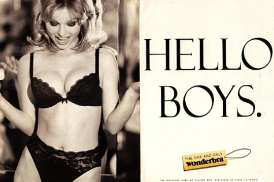
The second picture (bottom) was displayed on billboards; The caption 'Hello Boys' is inviting men to look at her, and encouraging the fact that they are allowed to objectify women and look as they please; and making it seem normal as they do this. The fact that she's looking down at herself and her facial expression also invites others to look at her, since she's not challenging their gaze.

Seeing adverts like this has also shown women that only a certain look is considered 'beautiful' in the media - which stirs up a lot of self-hate among those who look different from the models advertised.
This is evident now more than ever due to social media websites promoting the idea of self-hate.


However, men are starting to be exposed more over the past few years, with this as an example from 2007:


The difference between this and the other images shown here is every man in this photo is looking at the camera; giving us a challenging look that is almost threatening towards the viewer.
So despite being almost naked, the men are still looking dominant and fully aware, whereas most of the women are shown as unchallenging and welcoming to everyone's gaze.

The issue here is that women are implied to be weaker than men; that there seems to be double standards within the media which invites people to objectify women because it's more common for them to be seen with little clothes on - so why don't women deserve the same dignity as men?

If we don't look back and realise what is wrong with the media over art history, then this problem will never be resolved in the future.

CLOUDY WITH A CHANCE OF MEATBALLS

Monday 24 March 2014

My Final Piece

This is the final piece!


Done mostly on After Effects, I added in key frames to make the image spin at the right speed; I also had to incorporate the text individually and add in key frames for each phrase.
I did this because I originally made the whole image on Photoshop, with text included, so I would only have to add key frames to one image. However, when I imported it into After Effects and zoomed in on the picture (so that it spins out of frame) the text became pixilated and almost unable to read.

Despite this, I think the motion graphic works well, because it's informative, it spins at a good pace, and is easy to follow.
To bring it to life, I could add audio to the background; not anything too outrageous, just simple piano music or something soothing to listen to, which could help it flow better.


Monday 10 March 2014

Further Testing...

I completed another experiment, where I changed the timing of the rotation, to allow a pause in between each transaction so information can be processed by viewers...

Looking at the difference between my first and second tests, I can already see the difference in the spacing of the keyframes:

Test 1


Test 2

It's a lot easier to get a symmetrical rotation if your pivot point is on the very edge of the page. As you can see, the second test's lines all meet at the edge of the page, so you can see where the image is rotating from; whereas the first test the lines don't actually meet on the page, so I had to guess where the meeting point was to place my centre of rotation.


I definitely think this one runs a lot smoother then my first, and having the pauses definitely helps make it less blurred/speedy.
I need to create a better composition on Photoshop, with appropriate text and images that won't pixilate when I enlarge/zoom in on them.
Doing these tests made me realise that once you know what you're doing, it doesn't take very long to rotate the image... This being said, it will allow me more time to complete the final composition, and even add in small animated parts!

Animation Test...

When I came to start my final piece, I realised using "The Golden Age of Cartoons" was a lot of information to fit into a 30 second timeline... So I'm going back to my original idea of using the first pieces of technology that became the roots to developing animation as a technique. This is because the information is simple to portray, easy to follow as a chronology, and a simpler task for someone who hasn't made a motion graphic before...

I decided before going any further into making my final animation, I should do a test run first. This will allow me chance to experiment with Photoshop and After Effects to try and produce what I want, since I've never made anything like this before.

These are the steps I took to make my timeline on Photoshop...
I firstly drew an ellipse, which helped me to keep my lines evenly spaced and the same length all the way around.
Once I had drawn all the lines I need, I removed the ellipse, and was left with the third image down. After this I was able to rotate the whole page around, so I could align my images the right way around, ready to be rotated.
In order to be able to rotate my image across a timeline in After Effects, I created a video timeline on Photoshop, then elongated the length of every frame to 30 seconds. When exported into a film, this will open well in After Effects; allowing me to put in a centre rotation point, and add in key points to work out the speed of rotation.


Once I exported it and moved it to After Effects, I was able to change the scale, position, anchor point (rotation point), and put in key frames every 3 seconds to make my image rotate around the centre point.
I could either elongate the space between every key frame, making it move slower in a continuous motion, or I could make it rotate faster and pause at every piece of information.


After watching it back I realise I need to think about the composition and actual images used, so they all stay on the page and don't become blurry when zoomed in. 
I also believe that I need to pause the timeline every time it reaches a new piece of information, since that will make it easier for viewers to read and see the information.
This is my first test of rotating the image:


I will experiment further to see which speed works best, improve the composition in Photoshop, and see about adding some kind of title.

Tuesday 25 February 2014

Motion Graphics...

This is an example of motion graphics made in After Effects:


The shapes move and flow nicely, because I can tell they have used keyframes to make it run so smoothly. It's just shapes popping up and appearing at the right moment
On After Effects you can work on a big canvas, then focus the frame in the section of the image you want to be in the animation; so this creates an opportunity to make my solution to making my animation easier.
This is another, more technical motion graphic:


I like the fluidity of the transactions, because it makes it interesting to watch!
The audio suits the style of motion very well, giving it a futuristic feel.

Possible Idea - The Golden Age of Cartoons

As the title says, I want to base my animation on the chronology of the Golden Age of cartoons.

I think this is a significant time in the animation world, because this is where artists started to realise (inspired from the animations by the Fleischer Brothers, Reynaud, Starewicz and Reiniger) they can combine humour with drawings/stop frame movements; and this time period has seen some significant pieces of animation to inspire future generations into making TV series, feature films and games.

I wrote out a list of all the animations included in the lecture:


Writing it around this circle gives me a better perspective on how much information I want to include in my timeline - and theres a lot in there!

I will experiment and test the spacing of the lines, and work out how much information needs to be included/how big the images should be.
I still need to decide how to include images - should I draw them myself or find images from somewhere else?

I drew some of the characters that I would include in passing:


I think drawing all of these, plus more, will take me too long to make this animation. So to effectively manage my time, I have decided to revert back to my previous idea of using the first inventions to animate with, since there's less information there, and it will make my animation more straight forward.

Idea Development

I've looked through my notes and decided I want to base my animation on the devices used to animate "in the beginning".
This is because it seems more informative, and gives me the opportunity to explore different ways to present each bit of information; such as in these sketches:


These are a few different examples of transactions i could make between each bit of information, then when the transaction ends it will pause - straight on - at the object so viewers get a chance to absorb the information.

After making a quick storyboard, me and my tutor realised that my animation would be too complicated, and I realised there are a lot easier solutions.


I have decided I want to explore a simple circular timeline, where I will make all the images before hand around one centre point. I will focus the frame in one section of the canvas, so the information passes bits at a time.
I just need to decide what subject to base my animation on - since using this technique will allow me to include more information within 30 seconds.

Annotations around it are information I would insert if I was to base it on 'The Golden Age of Cartoons'


Wednesday 12 February 2014

Lecture 11: Postmodernism

Postmodernism is the plan to modernise our lifestyles, but in an affordable way.
Modernism collapsed because it was promoting a lifestyle that no one could afford, so designers changed their ideals to a postmodern world.

Renzo Piano and Richard Rogers, Pompidou Centre, Paris, 1972-77
James Stirling, Neue Staatsgalerie, Stuttgart, Germany, 1977-83
These two images are examples of how cheap materials have been used to make useful building parts. The pipes on the outside, the poles and architecture could be seen as a form of art, as well as useful.

Philippe Starck, Juicy Salif, 1990

This fruit juicer seems like a pretty ornamental, useful household object. However, it's regarded more on its aesthetics rather then its practical use. It's function doesn't work as well, so people would rather buy it as an ornament.

I think the idea behind postmodernism is good, because it's trying to give us a more affordable lifestyle. 
However, after reviewing a lot of the recent architecture, it doesn't seem as practical as the objects we 
use at the moment, it seems to have been made as a form of art rather then it's usefulness.

Wednesday 5 February 2014

Lecture 10: Modernism

Modernism is an artist movement, formed in the early to mid twentieth century; which explored the lifestyle of their time.
It represents how the Western world became modern, starting to create and use modern technology which was moving away from being governed by The Church, Monarchy and Patriarchy.

Jean-Honore Fragonard, Swing (1767)
Represents how the rich people lived, compared to the poor
The Industrial Revolution (1789)
This was the first ever bridge that could be lifted to allow boats to pass underneath, as well as coming together to allow cars and pedestrians over the top. This was a revolution of it's time, and has shaped our future technology.

Gustave Caillebotte's interpretation of how rich people lived (1877)
He observed the lives of people in a rich town, and realised they all wear certain, high class clothes, walk around with fancy umbrellas, and the streets are generally very clean.

Pablo Picasso's Cubism movement. Les Demoiselles D'Avignon (1907)
He was the pioneer of the cubism movement, he developed his own style from previous modernism works, starting a whole new era in modernism.

Typography and fonts were established between 1540 and 1996
This has lead the way through effective advertising and graphic design works, which have paved the way towards the future.

However, after this movement, the idea of modernism started to fail, since the luxury life style that it was representing was unaffordable to the general public; which is the irony in the idea that everyone can live luxuriously.


Tuesday 4 February 2014

Practical - Ideas for an Animation

Focusing on the Animation lecture we received, I want to make a walkthrough of part of the history of animation.

This could be represented in a timeline, simply moving through the information rather then animating characters or a narrative.

This is a good example of the technique of animation I could use:


It runs through information and facts using smooth transactions, simple shapes and typography to represent or describe the narration. This could work well as a chronology, since it is only visualising the information, rather then creating a narrative.

It could link into the information I find for my essay if I review some of the history of animation; The directors I research could have made a significant point in history.

The first section of this (below) is a good example of how I could approach this project; Since it clearly shows a timeline, and little movements within each picture it would be a good way to map out the chronology.


Essay Questions

Before the Christmas holidays, we were given 5 questions to choose from to write a 3000 word essay for. These are based on seminars we've been having since September:


1.    To what extent does animation fit with traditional notions of genre in cinema and film, and how has it responded to or developed these? Refer to specific examples in your response

2.    What is auteur theory and how successfully can it be applied to animation? Refer to specific examples in your response

3.    With reference to specific examples, to what extent can theories of the avant-garde be applied to animation?.

4.    How successfully has animation been used as a vehicle for politics, propaganda, or social cause?  Refer to specific examples in your response.


5.    How successfully has animation been used to represent gender and/or otherness? Refer to specific examples in your response


I decided I want to write about the auteur theory, because it's interesting to see what qualities an auteur has and who qualifies from the animation industry. 
I can talk about directors such as Tim Burton, Nick Park, Ray Harryhausen, Steven Speilburg and Alfred Hitchcock. About how films are distinct as their own - the character designs and visual styles generally look the same.
I will also write about how animating companies such as Disney take credit away from the animators and original authors when making feature films, as Disney's versions become the stereotypes.

http://dlibrary.acu.edu.au/staffhome/siryan/screen/auteur%20theory.htm 


Wednesday 15 January 2014

Lecture 9: Communication & Mass Media

 Mass Media is a means of public communication reaching a large audience in a short period of time. Communication methods such as television, newspapers, magazines and radio, are used to send messages of advertisement, or news to the population.

The best subject to communicate on a massive level is Graphic Design.
Graphic Designers use techniques such as typography, advertising, animation, printing media, branding, packaging etc. to communicate to the public.

Caveman drawings - Early example of communication
Early signs of animation
similar drawings that if viewed as one give the illusion of movement

An example of taking a Fine Art piece and turning it into advertising by adding text

William Addison Dwiggins, a successful designer, said this:
‘In the matter of layout forget art at the start and use horse-sense. The printing- designer’s whole duty is to make a clear presentation of the message - to get the important statements forward and the minor parts placed so that they will not be overlooked. This calls for an exercise of common sense and a faculty for analysis rather than for art’.  

Richard Hollis: ‘Graphic Design is the business of making or choosing marks and arranging them on a surface to convey an idea’ 

Edward Manet - A bar at the Folies Bergeres

Britain compared with USA Army advertisements

Edward Johnson created the typeface of the logo 'Underground'
The original underground map (1931) - too complicated

The current underground map - communicates the information easier

Looking at all of these typefaces and advertisements, I can see the development of our communication skills through time. Graphic Design is an effective way to communicate, since it can link to any subject such as Fine Art, Animation, Advertising, and any art subject, thus reaching a wider target audience. 
Although Graphic Design was born out of the capitalists interests, it is becoming more useful to publicise social issues, thus why I think it's becoming a more popular subject. 

Wednesday 8 January 2014

Lecture 8: Photography

This lecture was another chronology; the history of photography.

The first series of photos shown to us were from the 1800's. This one in particular is from 1888, from the book by Jacob Riis 'How The Other Half Live':


I find it interesting because it has a slight aggressive feel to it; the photo was not staged, so the subjects of the photo didn't really know what was happening - or the technology that was being used.
You can tell they feel slightly intimidated, at the same time as making you feel intimidated, due to the fact they seem unsure on what to do next. It's a good way to capture their ordinary every day life.
Where the first was unplanned, the gents below were ready to have this picture taken:


Lewis Hine's 'Russian Steel Workers' of 1908 and 'Duffer Boy' in 1909, were to bring attention to the child workers of factories. There's no particular sympathy for them, but they are standing in their own right.


This is an ironic photo in the sense that the magazines stuck on the walls would publish this type of photo.

Margeret Bourke-White took a series of photos "Sharecroppers Home" to try and portray the poverty that people like this boy lived in.

I think this is an interesting subject because photography can show important subjects such as poverty very simply but powerfully. You can see the torn clothes and basic furniture that this boy had to live with, which if shown in the right light can show people 'how the other half live'.


This woman on the right was the subject of Dorothea Lange's series of photos "Migrant Mother" (1936). 


She could be seen in a religious nature, in the sense of her caring about her children, no matter what poverty they live in.

In this series of photos, Dorothea Lange cropped some of the photos, to remove a thumb from the bottom corner, for example.

This shows some of the earliest signs of modernism.
Bergen-Belsen Concentration Camp

I found this documentary of war photograph by George Rodger interesting, because it shows a young boy just strolling past some dead bodies - from a concentration camp - obviously unaffected by what he is seeing. 
This shows how the war affected young people's thoughts on the events that were happening around them, almost as if they think it is normal.

Robert Haeberle photographed these "People about to be shot" (1969).

Apparently, he told the shooters to stop, so that he could get a photo of these people just before they were killed.

It's interesting because you can see the despair in their faces and body language - no one knows why they were sentenced to death, or what was going through their minds as they were lined up to be shot...

It is a rare moment to capture on film, so Haeberle took the opportunity when he could, and captured the emotions well.

This is the last photo that was shown in the lecture.

"this work brings together" says the artist "in a very dense way, all the obsessions of my earlier works; traces, scars, the destruction of human presence, or the obstacles of all kinds that are built in order to keep others out".

This quote that was shown with the photo makes sense; it gives the destruction of this road more meaning, since it represents how we sometimes destroy our planet or each other.

Learning some historical facts about Photographers and their work has been interesting, since I never knew photographs could have such big background stories/meanings.